Rendering Megascans Textures
We celebrated our 10K assets milestone a few weeks ago, and while it’s great that you have all these assets to use, how exactly should you render them?
Our own Adnan Chaumette will be showing you just that, as he walks us through how to leverage Megascans textures in Marmoset Toolbag to create portfolio-ready renders for your materials.
We’ll be covering the contents of this article in more detail on Friday, October 18th at 7 PM CET, so don’t forget to tune in!
In this first long-form tutorial, we’ll be exploring the typical material setup of Megascans textures, and how you can push them beyond to the next level by understanding the role of each texture.
This article is mostly geared towards people who are just starting out in 3D, however, we do recommend anyone to read it, as there are all sorts of useful tips in here that will help even seasoned pros.
You can check out the Megascans surfaces we use to demonstrate the process here.
Give me all the textures!
Before downloading a Megascans asset, you get to choose what texture to download, and there are a lot of them!
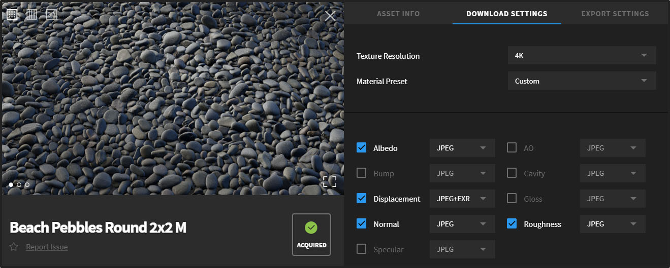
Unless you’re an experienced artist, all these options can be confusing, so we simplified that by including a “Material preset” system, which helps you pick a specific set of textures depending on the renderer that you use.
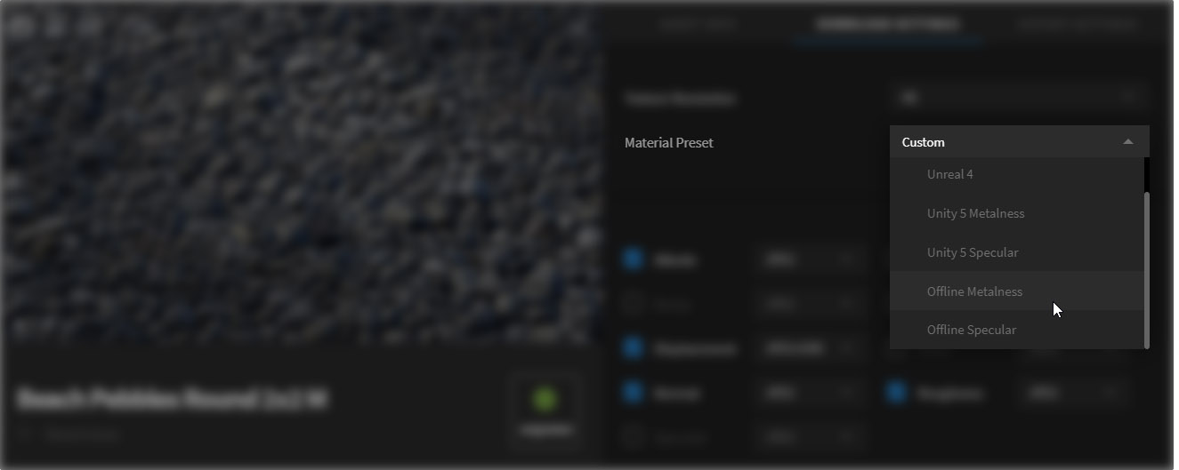
So if you’re an Unreal Engine user, selecting the “Unreal 4” preset gives you these textures:
- Albedo
- Normal
- Displacement
- Roughness
- AO (Ambient Occlusion)
- Metalness (only exists for metal assets)
- Translucency (only exists for specific assets, like plants for instance)
It’s worth noting that this “Unreal 4” preset works in other renderers as well, including Marmoset Toolbag 3.
For demonstration purposes, we’ll be using Toolbag 3 to render a surface. The workflows and techniques that we’ll be discussing here apply to most real-time (UE4, Toolbag, Unity, CryEngine) and offline (V-Ray, Redshift, Arnold, etc.) renderers.
Feel free to brush up your Toolbag 3 skills by watching this short tutorial!
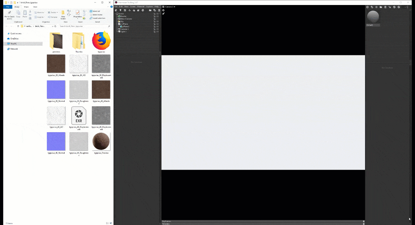
To follow along, please download this scene, which contains the Marmoset Toolbag scene we’ve used to create the banner render.
A look at the basic textures
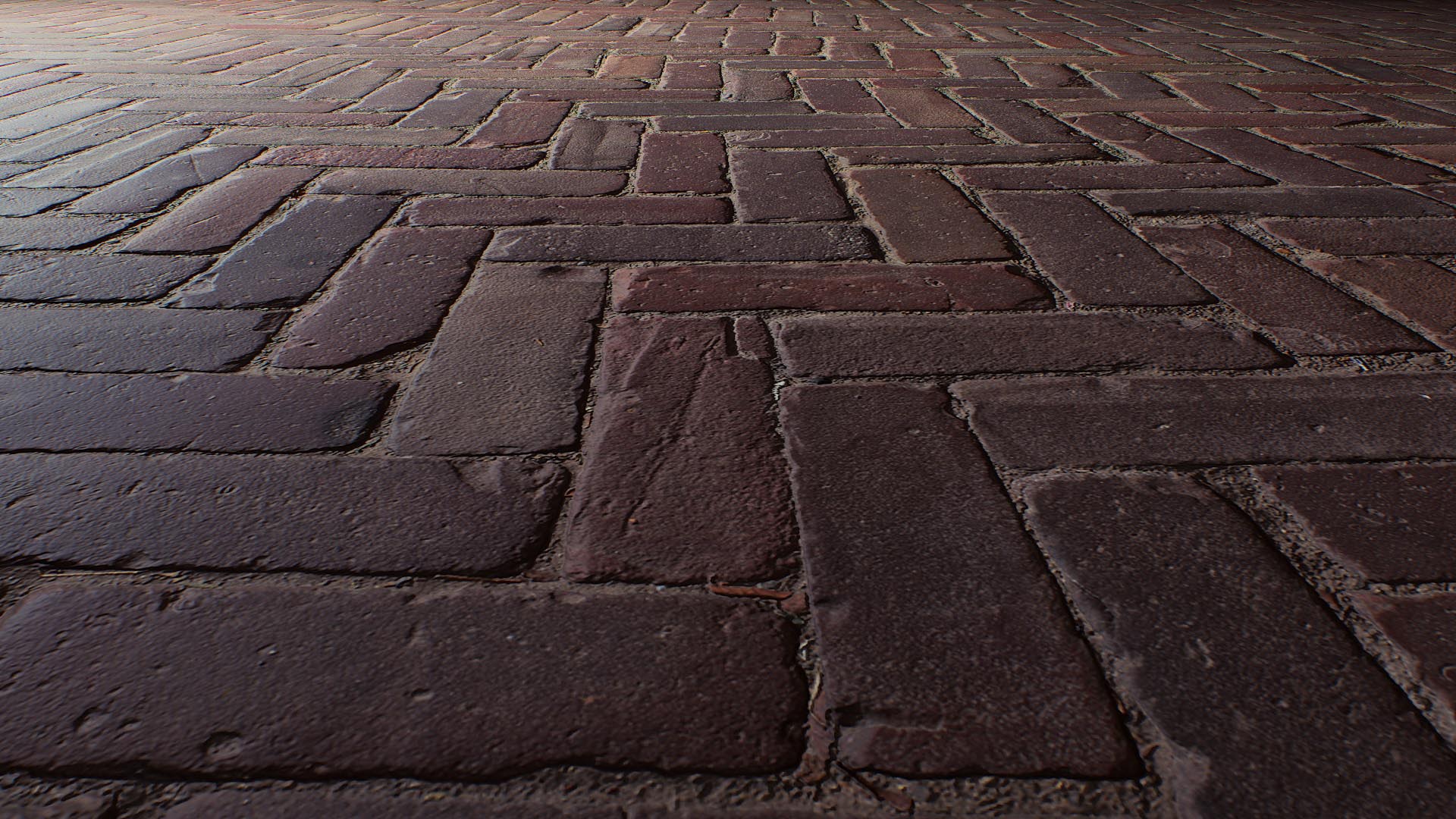
To start off, let’s assign the albedo map of our asset to the Albedo slot in Marmoset Toolbag 3 (we’ll refer to it as TB3 moving forward):
It’s a super simple process as you can see. Now if we take a closer look at our Albedo settings in TB3, you’ll notice that there are no shadows or lighting information in that image, and that’s because this image is a “PBR” texture. We’ll be giving you an extensive and simplified PBR guide, but for now, just know that it’s up to the render engine to create the shadows and lighting dynamically.
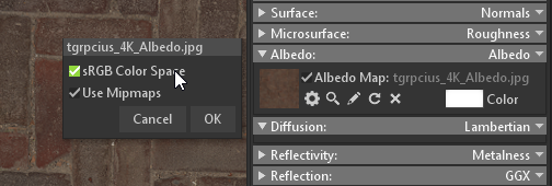
The Albedo, Translucency and Specular textures need to be in sRGB (often called non-linear); other textures should always be in linear space unless specified otherwise. The reasoning behind that is simple: the pixels in a normal map or a displacement map aren’t just colors that you can tweak like the albedo. Each pixel contains actual data that represents a property, like how intense your normal map is or how shiny a roughness map is at a specific pixel.
We’ll be exploring the sRGB (often called non-linear) and linear terms in a future article, but in short, those two terms refer to the “color space” of an image, which helps the computer interpret the colors of your textures.
Giving life to your surfaces
Now back to our textures, let’s go through some basic definitions:
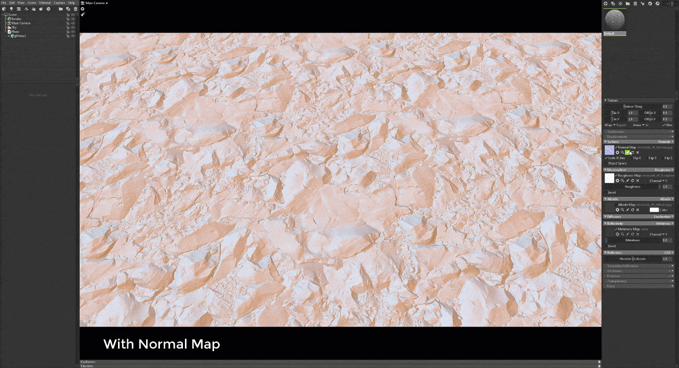
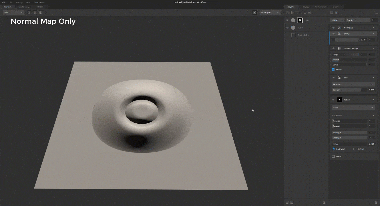
A normal map allows you to fake details complexity and depth by playing with the light in your scene.
To showcase it in action, check this illustration where we apply a normal map on a plane:
A roughness map dictates how rough the reflections of your surfaces should be. A value of 0 makes the surface fully reflective, while a value of 1 does the opposite.
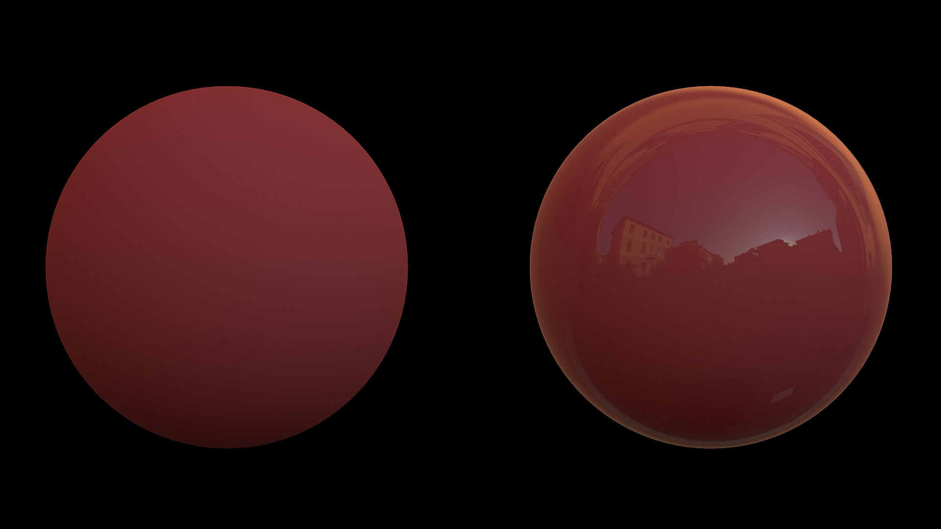
The sphere on the left has a roughness value of 1, and the one on the right a value of 0
Now if we add in a normal and roughness, our surface should roughly (no pun intended) look like this:
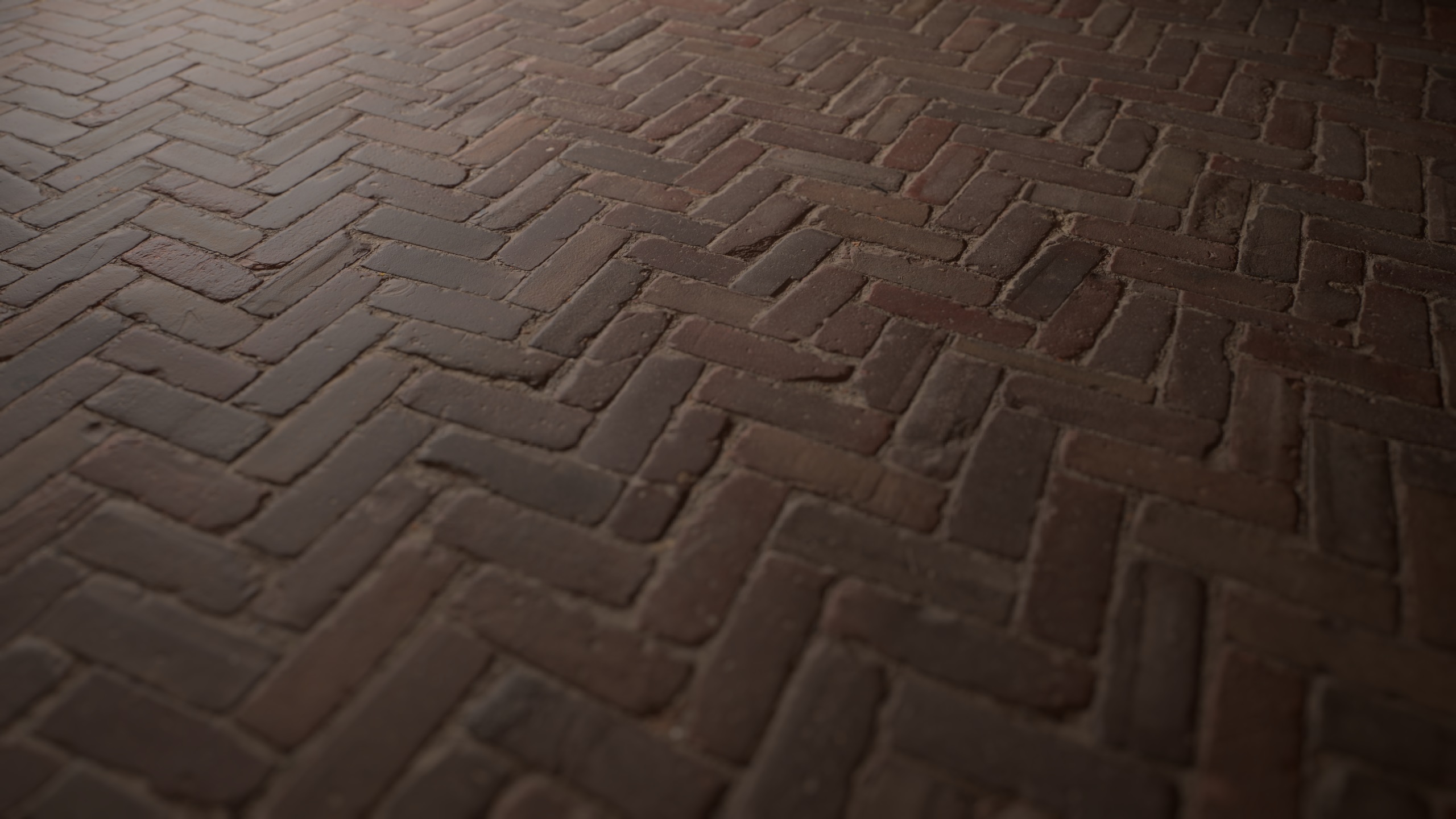
Safe to say that a render like this won’t land you a job at Naughty Dog, though, so let’s improve it!
There are common misconceptions about how to use a roughness map and when to use it versus using a gloss map. A gloss map is just a reversed version of a roughness map, in short. Most PBR engines do support either one of them, but PBR as a standard generally works with the roughness map.
This is great and all but it doesn’t fix our render quality, so let’s get back to that!
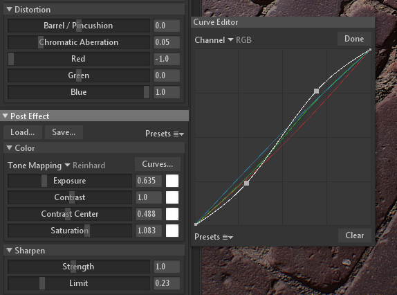
The tone mapping parameters of the camera were edited by lowering the exposure and setting the sharpen strength to 1, then the Curve Editor was used to increase the blue colors in the render and decrease the red colors, which is akin to lowering the temperature of colors.
Then another light was added at the top-left corner of the screen, increased the intensity of the newly created light (which was set to directional) and lowered the intensity of the skylight to near 0.25.
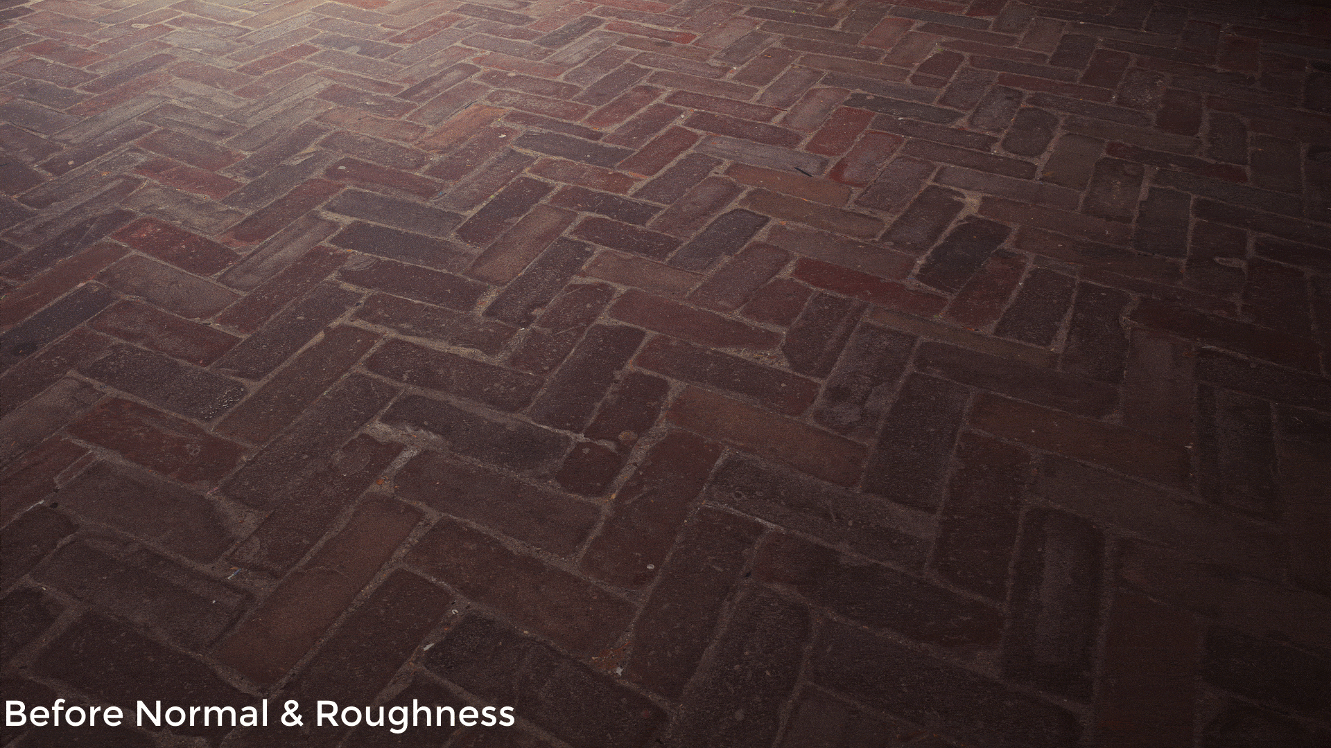
Now if we look at our render, you’ll notice that it looks much better with the normal and roughness:
Newcomers in the industry often work really hard on their materials/scenes but don’t bother too much with the post-processing and color grading stages, which is where the magic truly happens. It’s a topic that we want to cover extensively in videos and articles moving forward, so stay tuned for that!
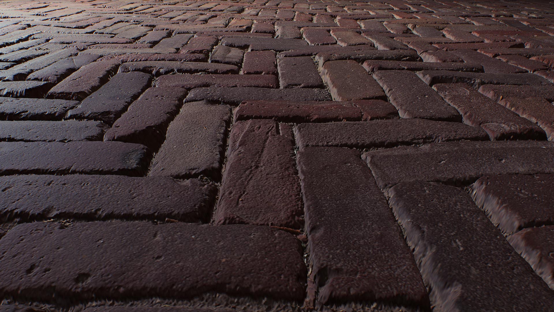
Now back to our surface. The normal map helped with the detailing quite a bit, but we’re still fundamentally missing some depth here, and to fix that we can leverage the displacement map.
Displacement maps are grayscale images that represent height data. Remember what we said about normal maps: they fake details by playing with the light. They don’t add any additional geometry on your objects though, and that makes them look great from certain angles, and not so great from others:
As you can see the surface looks rather flat when viewed at a grazing angle, and that’s because a normal map cannot modify the shape of an object. This is where the displacement map comes into play.
Creating depth with displacement mapping
The goal of a displacement map is to modify an object’s surface, giving you a real sense of depth, unlike a normal map. This illustration shows you the difference between both:
Now if we apply our displacement it’ll look much, much better:
Just like the normal map, your displacement map should always be in linear color space, not sRGB or non-linear.
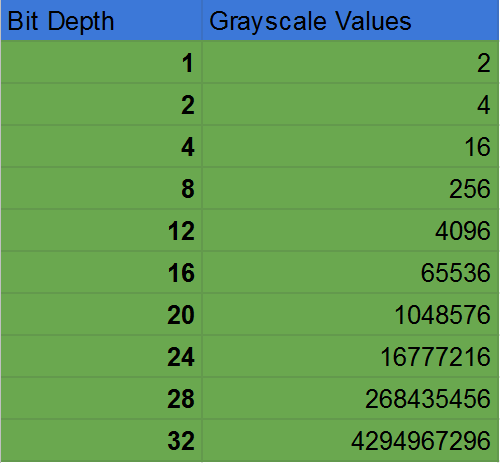
One thing that you need to take into account for displacements is their bit depth, which basically stands for the number of colors you can store in an image. Let’s talk about that for a bit, as it’s very important to understand bit-depth in order to know how to use displacement maps.
Bit Depth
To simplify the concept a bit (pun intended): Each pixel in your image has its own color, and each color refers to a red, green and blue channel. Your average color picker represents this pretty well with its RGB option:
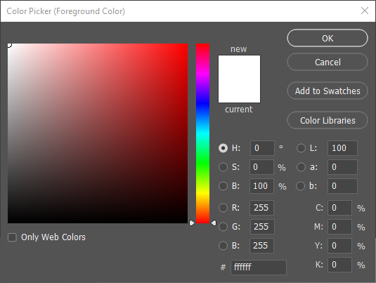
Note that the number here starts at 0, hence why it’s 255 instead of 256
How exactly are 8-bit and 256 related, you might ask? Here, 256 refers to the power of two of 8, and you can check the data of all bit depth values right here:
Having a basic understanding of displacement maps will help you tremendously whenever you have to deal with texture compression or stepping issues, and we’re just scratching the surface of what will be a more extensive read on displacements at some point in the future.
Unlike normal maps, a Displacement map actually modifies your geometry, and if you have a pixelated image that doesn’t have enough colors, the end result will have some steppings into it, which reflects the lack of color values between each pixel:
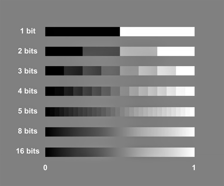
Image courtesy of Azooptics (image is set to 8-bit due to web limitations)
Megascans gives you 32-bit displacements, which is the highest standard in the industry as of this writing.
Do keep in mind that you’ll need to use the EXR image of your displacement, not the JPG one when using Megascans assets. If you’re using Bridge (which we really recommend for any Megascans user), we generally recommend that you download your asset from there and convert your texture maps to a format like PNG, which supports 16-bit depth.
Downloading in EXR, then converting to other formats is the recommended process in general because if you convert a JPG to a PNG the result won’t change at all.
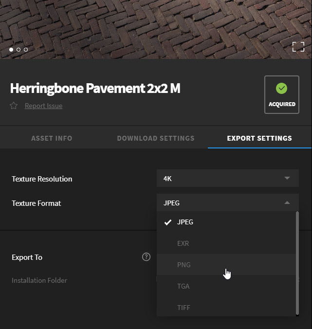
The Export settings in Bridge allow you to modify your image format
Before we move on, keep in mind that for a displacement map to work you need to subdivide/tessellate your geometry, leading to many more polygons, which can be very expensive if you’re using a game engine.
Putting it all together
With our displacement properly set, some Depth of Field was added in the camera to render this nice little video:
Another angle was taken, with the light tweaked, then some basic color grading was applied in Photoshop to get this alternative screenshot:
If you’re curious about the use of Metalness, Specular, AO, Translucency and the likes, stay tuned for more articles dedicated to those maps specifically. Metalness and Translucency both serve a very specific purpose, and as such, it wouldn’t do them justice by cramming them into this already extensive blog post.
And that’s it for this first tutorial! We hope you’ve enjoyed reading it and learned some new stuff, and don’t forget to check the live stream on Friday at 7 PM CET, where Adnan will be giving you a lot of cool tips and tricks to create your own renders.